
Blog · Build Stories · Heart Runner
Build Story · Heart Health Runner Game
How we built a heart health runner game for events
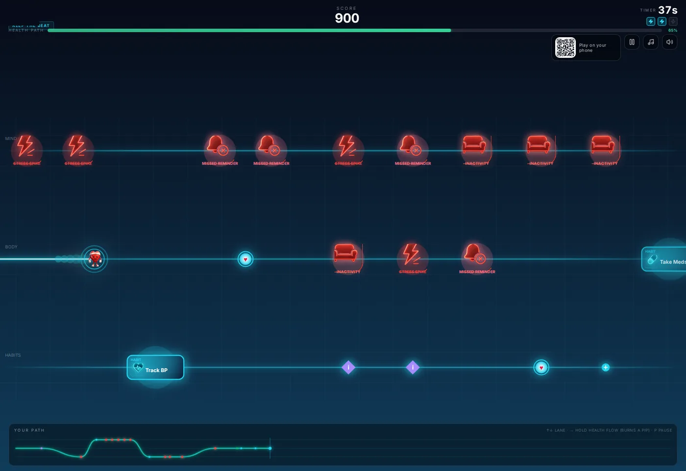
A digital heart health company wanted event attendees to understand their core message in about a minute: your heart stays on track through small daily habits, life throws setbacks at everyone, and what matters is getting back on path. We turned that message into a runner game where a small heart character literally runs along an EKG line. The screenshots in this post are from the real concept build, shown with the client's branding removed. Here is how it was designed, developed, playtested, and delivered.
The brief
The client exhibits at health and benefits events where attention is scarce and most booths are handing out brochures about behavior change. Their goals: stop foot traffic with something alive, teach the habits message without a lecture, and capture interested attendees for follow-up. The tone mattered as much as the mechanics. Heart health messaging can easily sound like scolding, and nobody plays a game that scolds them. The game had to make the healthy path feel good, treat setbacks as normal life rather than failure, and always show the way back.
Design: a runner who lives on a heartbeat
The EKG line is the track
The central design idea came early: the runner does not run on a road, it runs on an electrocardiogram trace, the most recognizable line in heart health. The track glows, the character is a heart, and the whole screen pulses with the product's subject. When the run ends, that same line becomes the report: the game redraws your 60 seconds as a path graph, so the visual motif carries the opening, the gameplay, and the results.
Three lanes: Mind, Body, Habits
The game has three lanes, switched with a swipe, the arrow keys, or a controller D-pad. The lanes are the client's three content pillars: Mind, Body, and Habits. Everything on the track belongs to one of them, so a player is sorting their attention across the client's framework for the entire run without ever being told they are learning a framework.
Collect the good
Positive items are a small taxonomy, each with a distinct job:
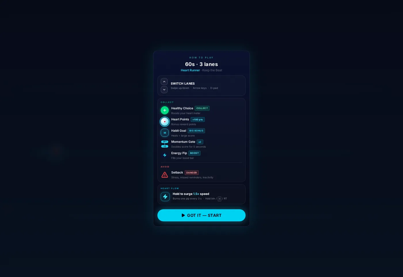
- Healthy Choices boost the heart meter, the forgiving everyday wins.
- Heart Points are pure bonus, worth 100 points each, placed to reward brave lane changes.
- Habit Goals are the named behaviors the client teaches, drawn as glowing tiles on the track: Take Meds, Track BP, Move More, Healthy Meal, Sleep Well. Collecting one heals the runner and pays a large score bonus, so the specific habits are the most valuable things on the track.
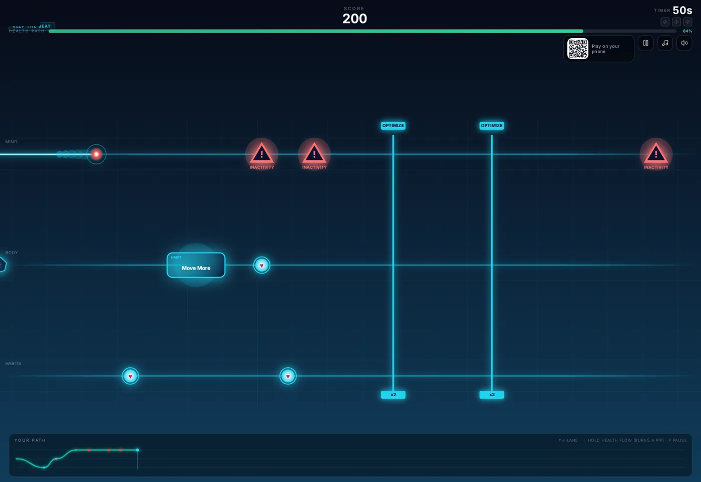
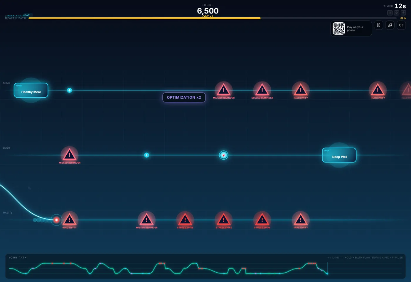
- Momentum Gates, labeled OPTIMIZE on the track, double scoring for five seconds when you pass through them. While one is active the score readout shows OPT ×2, so players can see exactly why their points are climbing.
- Energy Pips fill the boost bar that powers the surge move.
Dodge the setbacks
Hazards are named after the real reasons people fall off a heart health routine: Stress Spike, Missed Reminder, and Inactivity, drawn as a couch you have to get off of, metaphorically and literally. Hitting one is recorded as a deviation, not a death. The runner stumbles, the path trace dips, and play continues, because the client's message is that a setback is a detour, not the end of the story.
Heart Flow: the surge
Holding the action button triggers Heart Flow, a 1.5 times speed surge that burns one energy pip every three seconds. It is the game's skill move: surge through a clean stretch to bank points, or burn a pip to escape a wall of hazards. Spectators understand it instantly, which matters at a booth, and it gives better players a reason to come back and master the run. In surge the heart stretches into a comet with a motion trail, so everyone watching can see the move is on.
Sixty seconds, three difficulties
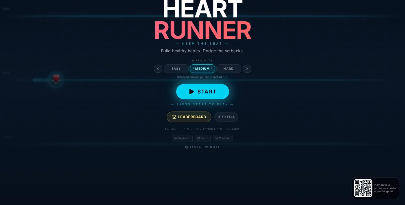
A run lasts 60 seconds, long enough to hit every content beat and short enough for a line to move. Before the run, the player picks Easy, Medium, or Hard. Difficulty changes hazard density and pays a score multiplier, up to 1.25 times on Medium in this build, so a returning player can handicap themselves and a nervous first timer still gets a full, successful feeling run.
One teaching screen, not a tutorial level
Booth games cannot afford a tutorial level. Instead, tapping Start opens a single how to play card that lists the controls, the collectibles, and the hazard in plain language. It takes five seconds to read, it is skippable on repeat runs, and in playtesting it eliminated nearly all of the "wait, what do I do" first runs that a cold start produces.
Development: building the run
The game is a browser application, like every game we ship, so the same build runs full screen on the booth display, on a touchscreen kiosk, and on a visitor's phone through the QR code on screen. Under the hood, a few systems do the heavy lifting.
Lane movement and the path recorder
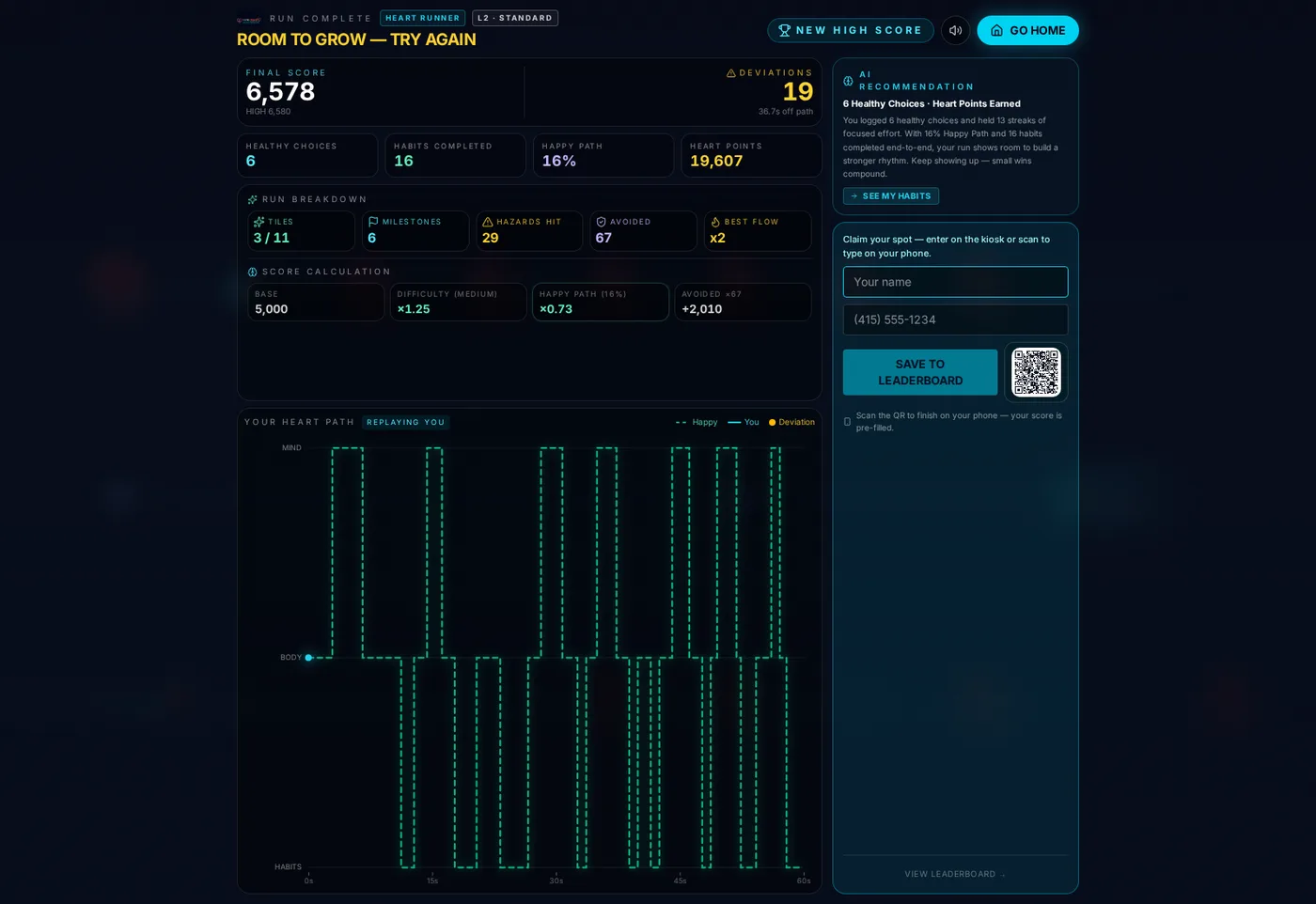
Movement is discrete lane switching with a smooth slide between lanes, which reads clearly at a distance and forgives imprecise inputs from a player holding a coffee. Every input is timestamped by the path recorder, a small system that logs lane changes, collections, and deviations as the run happens. That log powers two things players love: the live Your Path strip at the bottom of the screen, which draws their run as it unfolds, and the end of run path graph, which replays their minute as an EKG style trace with the happy path marked against their own line.
A scoring model you can show your work for
Most arcade scoring is a black box. This one publishes its math on the results screen, because the client wanted the score to feel earned and explainable:
- Base score for completing the run.
- Difficulty multiplier, so harder runs pay more.
- Happy Path factor, the share of the run spent on the ideal line, which scales the total up or down.
- Avoided bonus, a per hazard payment for everything dodged.
- Streak bonus for the best Heart Flow multiplier held.
The results screen also reports the story behind the number: healthy choices logged, habits completed end to end, hazards hit versus avoided, and a short written recommendation generated from the run, in the client's encouraging voice. It reads less like a game over screen and more like a friendly coach's note, which is exactly the relationship the client's product wants with its users. Even the deviation count is reported in the game's own terms, as seconds spent off the ideal line: in our studio reference run the graph showed 36.7 seconds of deviations, alongside 13 scoring streaks and 6 milestones. Numbers like that give a player something specific to beat on the next run.
Small details that carry the message
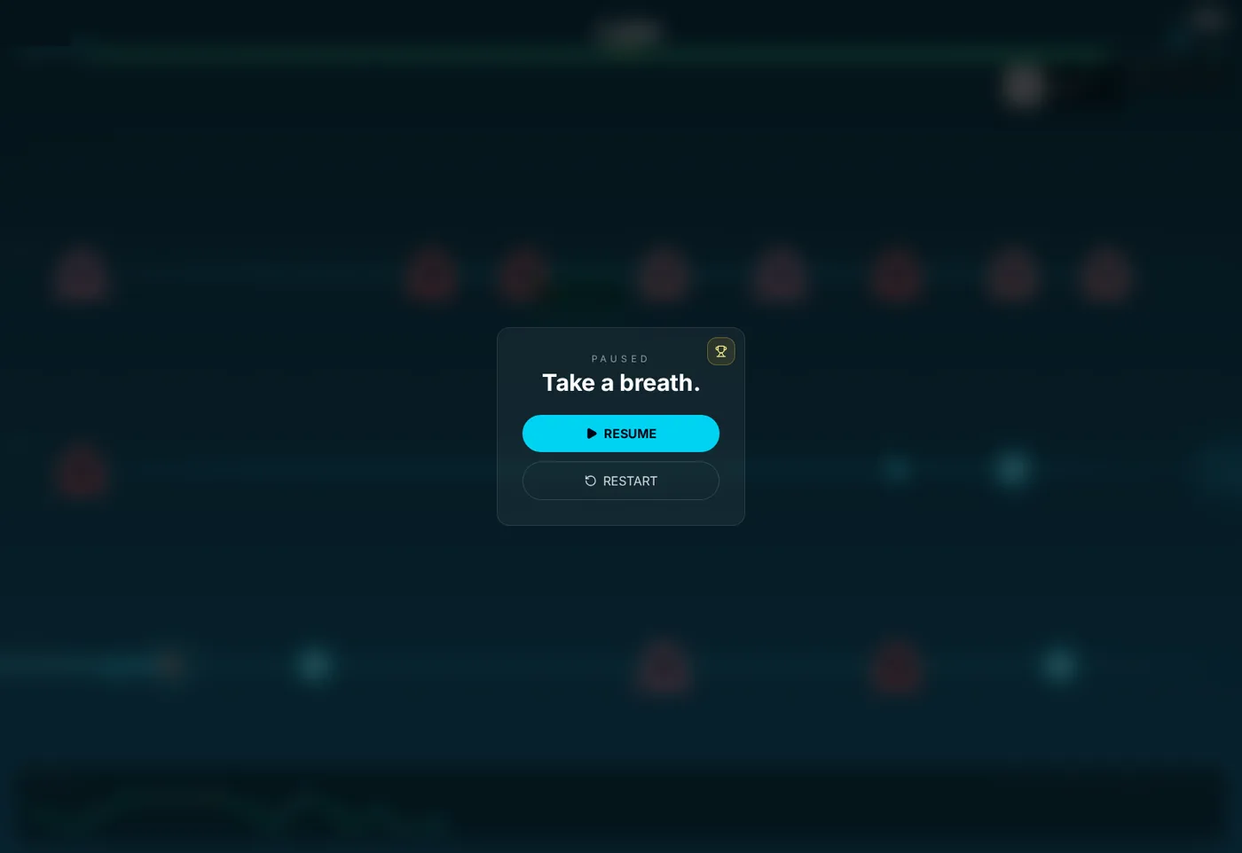
Runs can be paused with the P key or the on-screen button, and the pause card itself stays in the client's voice: it reads "Take a breath." and offers Resume or Restart. The soundtrack is an original chiptune loop, chip-arcade in feel, and the home screen carries an effects level toggle (FX Full) so booth staff can calm the visuals for a quieter hall. The health path bar at the top also changes color as a run drifts, shifting from green toward gold, so a player's standing is visible at a glance without reading a single number.
Attract mode and the winner moment
Between players, the home screen is the booth's billboard: the title, the tagline "Build healthy habits. Dodge the setbacks.", the difficulty picker, and one big Start button. A Reveal Winner control lets booth staff call up the day's champion on demand at the end of the event, which turns the leaderboard into a small ceremony instead of a screen people glance at. That control sits behind an operator password, so only staff can trigger the reveal, and the public leaderboard hides players' phone numbers; the numbers exist for the winner announcement and the follow-up list, not for display. Small privacy decisions like that matter in a health product. The leaderboard itself persists through the day, and scores survive a browser restart.
Playtesting and tuning
Three findings shaped the final build. First, hazards had to be readable by color alone at ten feet, so setbacks got the red glow and collectibles the cyan, and playtesters who could not read the labels could still play correctly. Second, early builds punished deviations too hard, and testers described the game as "judgy", the one word the client could not afford. We softened the penalty, renamed failures as deviations, and made the recovery visible on the path trace. Third, the written recommendation needed to lead with what the player did well, because testers who were praised first actually read the advice that followed. The final tone pass was done with the client's own content team, in their voice, not ours.
The difficulty curve was tuned the same way, by watching runs rather than guessing. The opening ten seconds are sparse, so a new player learns lane switching on easy pickups. Density climbs through the middle of the run, and the final stretch is deliberately crowded: hazard walls on two lanes at once, habit tiles placed as the safe route through them, and OPTIMIZE gates close enough together that a good player can chain the multiplier to the finish. The frame below is twelve seconds from the end of a real run, with the path strip at the bottom showing the whole minute's story of climbs and dips.
Delivery: from our studio to their booth floor
- Slide deck setup. A laptop, an HDMI cable, and the display. The game runs in a browser at full screen. Our team stands by during the client's setup time, and phone and email support are included.
- Every input covered. Keyboard, touchscreen swipe, and USB or Bluetooth controllers all work, so the same build fits a staffed big screen or a self-serve kiosk.
- Phones join in. The QR code on every screen opens the game on a visitor's phone. Players who start on the booth screen can even finish claiming their leaderboard spot on their phone, with their score pre-filled.
- Lead capture built into the ending. The results screen is where players are happiest, so that is where the name and phone fields live, tied to the leaderboard and the high score moment. The captured list goes to the client after the event.
- Ready to re-theme. Lanes, habits, hazards, and the recommendation copy live in a content layer. A different health topic, or a fresh campaign, is a content pass on the same engine.
The finished game lets a booth visitor feel the client's whole philosophy in one minute: habits are valuable, setbacks are normal, and the path back is always right there. That is a lot for a brochure to compete with.
Questions about a build like this
- How long does a run take?
- Sixty seconds, by design. A booth run has to teach the message, produce a score worth comparing, and hand the screen to the next player quickly. Three difficulty levels let first timers and confident players both get a fair run.
- Can the habits and hazards be changed for a different health topic?
- Yes. The collectibles, hazards, lane names, and end of run messaging all live in a content layer. The same engine can carry a diabetes, sleep, or medication adherence story with new content and a new theme.
- How does lead capture work in the game?
- The results screen invites the player to claim their spot on the leaderboard with a name and phone number, on the kiosk or on their own phone by scanning a QR code with their score pre-filled. The captured list goes to the client after the event.
Have a message a game could carry?
Tell us what visitors should remember and we will build the game around it. Start with a concept, or see a different mechanic carry a different message in the stacking game build story.